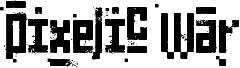
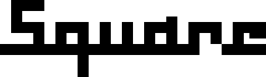
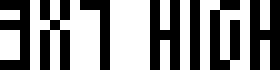
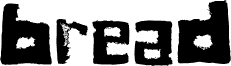
Ancient G Modern autorstwa Gen Aris to darmowy, pikselowy font bitmapowy o surowym, futurystycznym charakterze. Zbudowany z masywnych, prostokątnych kresek, kwadratowych wycięć i ostrych, schodkowych narożników, litery wyglądają jak zakodowane znaki wyświetlone na ekranie wczesnego komputera.
Jego sztywna geometria idealnie pasuje do interfejsów gier, plakatów sci-fi, oprawy graficznej muzyki elektronicznej i eventów technologicznych. Ten darmowy font najlepiej sprawdza się w krótkich nagłówkach lub tytułach, gdzie nietypowe otwory i blokowe, zazębiające się kształty mają wystarczająco dużo przestrzeni, by wybrzmieć bez utraty swojego dziwnego, monumentalnego rytmu.
--
Ancient G Modern to rozszerzenie zestawu glifów SGA/SG1 ANCIENT canon, oferujące pełniejszy font. Rozróżnia wielkość liter oraz zawiera znaki interpunkcyjne i rozszerzone znaki specjalne.
Pytania lub uwagi można kierować na adres
genaris at gmail dot com
by Gen Aris -Inspired by fan fonts Anquietas, Alteran, & my personal prefs . . .
Rodzina czcionki
Ancient G Modern
Podrodzina czcionki
Regular
Wyjątkowa identyfikacja podrodziny
Ancient G Modern:Version 1.00
Pełna nazwa czcionki
Ancient G Modern
Nazwij wersję tabelki
Version 1.00 September 26, 2008, initial release
Postscriptowe imiona czcionki
AncientGModern
Zawiadomienie o znaku towarowym
FANS are welcome to USE or MODIFY at will but please RENAME any modified versions you may create as to avoid confusion. :)
Producent
Gen Aris
Projektant
Gen Aris
Opis
A variant of the ANCIENT glyphsets used by the Ancients in Stargate: Atlantis.
The purpose with this revision is to CREATE PUNCTUATION and ADDITIONAL CHARS/SYMBS to facilitate better clarity when applying this font to English documents which contain punctuation and other characters.
Per show canon, the Ancients did not appear to use punctuation marks, nor did they distinguish between Upper/Lower case. Again, to facilitate use of this font in regular documents or even as the Windows font (for menus etc) I have created CAPITALIZED VARIANTS which are identical to the lower case except I added a SQUARE DOT FLOATING ABOVE TOP LEFT of CAPPED KEYS. Passwords and user names sometimes use L/case and U/case letters, so it is necessary to distinguish the 2 cses in daily life here on Earth!
My logic for the design of new characters is as follows:
Letters are made up of white/black blocked spaces dividing on a 3 wide by 4 high grid. A few letters make use of subdivsions within the grid.
In canon, all numerals share a centered descender "tail" unlike the letters.
I took this further, by giving all punctuation mark glyphs a centered ascender on top, like an upside down version of the numeral tail -- an "antenna" if you will. This should make it easier to become facile at visually distinguishing punctuation marks from letters or numbers.
Some punctuation marks or symbols are used in numeric/math contexts partly or wholly. So, math or number oriented and shared alphanumeric/math punctuations are given the "tail" of numerals and the "antenna" of punctuation/symbols to so indicate the context.
The numbers, in canon, have a slightly more subdivided or even an altered grid used in their design than do the letters. Here, as well, both numbers and punctuation/symbols share this more prominent use of subdivision or underlying grid different from the letter glyphs.
Overall, I tried to adhere to the digital, techno-sensibility of the glyphs as seen in SG-1 and SGA while striking a balance with variations of weight and tone so as to be reasonably attractive, while remaining aware of the need to make this practical and functional. How well I fared toward my goals, I leave to you to decide. :)
Gen Aris genaris@gmail.com
Rozszerzone informacje o czcionce
Obsługiwane platformy
PlatformaKodowanie
UnicodeUnikod 2.0 a nasledovná sémantika, tylko BMP unikod
MacintoshAntykwa (roman)
MicrosoftTylko BMP unikod
Szczegóły czcionki
Utworzono2008-09-27
Wersja1
Liczba glifów121
Jednostki na em1000
Prawa osadzaniaOsadzania dla stałych instalacji
Klasa rodzinyNieklasyfikowane
GrubośćŚrednia
SzerokośćBardzo ściśnięta
Styl MacPogrubiony
KierunekTylko znaki skierowane od lewej do prawej + zawiera neutralie