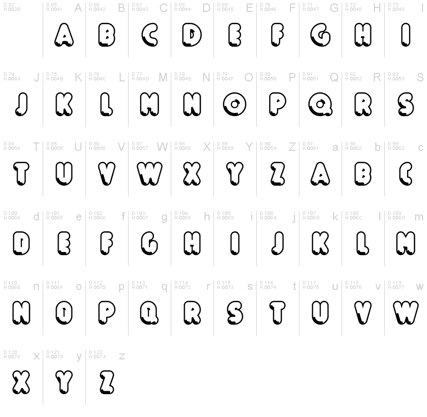
Boule Reduced Contour
TrueTypeDo użytku osobistego
BouleReduced-Contour.ttf
Tagi
Uwaga autora
Boule Reduced Contour font is a cool groovy typeface designed by ingoFont.
BOULE
Capitalized, GEOMETRIC, bold and ROUND.
If the typographer sees a font like that, it's enough to make his toes curl. But sometimes it just has to be that way.
Geometrically constructed fonts do not necessarily have to be pointed and angular; It also works consistently around. And if I say it consistently, then in this case, that's done consistently.
The basis for the BOULE is the circle. The letters are drawn with constant line width, the corners and endings all have the same radius, the lines are all the same thickness.
The BOULE consists only of capitals. There is only one difference in the use of uppercase and lowercase letters: in the uppercase letters, the round letters are circular, while the lowercase letters are narrow.
The Boule is not only very fat, it also runs very tight; that is, the glyphs are very close to each other. To avoid "holes" due to unfortunate letter combinations, the Boule contains ligatures for FT, ST, TT and TZ.
There are also other versions of the font: Boule Brillant on the one hand. In this version, simple highlights simulate a light incidence from the top right. These light edges give the font a decorative effect that makes it easy to think of wet sausages or balloons in some shapes.
And finally the Boule Contour. As the name implies, it is the outer contour of the letters, combined with a shadow at the bottom left.
The name Boule (French for ball) says it already: this font is globated. Therefore, it is also very suitable for all three-dimensional alienation effects. With simple light and shadow you can achieve a very convincing 3D effect with little effort.
Mapa znaków
Proszę korzystać z menu rozwijalnego aby podglądać różne mapy znaków zawierane do tej czcionki.

Podstawowe informacje o czcionce
Prawa autorskie
Copyright (c) 2019 by Ingo Zimmermann. Alle Rechte vorbehalten.
Rodzina czcionki
Boule Reduced
Podrodzina czcionki
Contour
Wyjątkowa identyfikacja podrodziny
IngoZimmermann: Boule Reduced Contour: 2019
Pełna nazwa czcionki
Boule Reduced Contour
Nazwij Wersję tabelki
Version 1.015
Postscriptowe imiona czcionki
BouleReduced-Contour
Zawiadomienie o znaku towarowym
Boule Reduced Contour ist eine Marke von Ingo Zimmermann.
Producent
Projektant
Opis
Copyright (c) 2019 by Ingo Zimmermann. All rights reserved.
Rozszerzone informacje o czcionce
Obsługiwane platformy
PlatformaKodowanie
UnicodeUnikod 2.0 a nasledovná sémantika, tylko BMP unikod
MacintoshAntykwa (roman)
MicrosoftTylko BMP unikod
Szczegóły czcionki
Stworzony2019-04-20
Korekta1
Liczba znaków54
Jednostki po Em1000
Prawa osadzeniaOsadzania dla stałych instalacji
Klasa rodzinyNieklasyfikowane
GrubośćGruba
SzerokośćŚciśnięta
Styl MacKursywa
KierunekTylko znaki skierowane od lewej do prawej + zawiera neutralie
Natura wzoruObrysowywany
GęstośćNierówny
Kompletna paczka zawiera 3 grubości które są wymienione poniżej:
BouleReduced-Contour.ttf
BouleReduced-Brillant.ttf
BouleReduced-Gras.ttf
BouleReduced-Brillant.ttf
BouleReduced-Gras.ttf
Boule Reduced Brillant
TrueTypeDo użytku osobistego
Boule Reduced Gras
TrueTypeDo użytku osobistego
