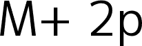
Duru Sans by Onur Yazicigil of Sorkin Type Co. is a free humanist sans serif with open proportions. Even strokes and gently shaped joins keep the letters from feeling mechanical. The broad curves look especially relaxed.
Its calm structure suits cultural posters and wayfinding, offering clarity without an industrial edge. Soft curves also fit museum branding and understated packaging aimed at an approachable audience. In editorial design, it provides a measured voice for section headings and magazine cover lines.
Duru is low contrast a classic 20th century style sans design. Duru is a new take on mixing the humanist urge with the modernist one.ÊDuru also somehow manages to be elegant and a workhorse type at the same time. Duru can be used at a wide range ofÊsizes.
Rozszerzone informacje o czcionce
Obsługiwane platformy
PlatformaKodowanie
UnicodeUnikod 2.0 a nasledovná sémantika, tylko BMP unikod
MacintoshAntykwa (roman)
MicrosoftTylko BMP unikod
Szczegóły czcionki
Utworzono2011-12-17
Wersja1
Liczba glifów425
Jednostki na em2048
Prawa osadzaniaOsadzania dla stałych instalacji
Klasa rodzinyBez szeryfów
GrubośćŚrednio lekka
SzerokośćPodstawowa
Styl MacPogrubiony
KierunekTylko znaki skierowane od lewej do prawej + zawiera neutralie