Em One SemiBold Italic
TrueTypeFreeware
- Akcenty (częściowe)
- Akcenty (pełne)
- Euro
EmOne-SemiBoldItalic.ttf
Tagi
Uwaga autora
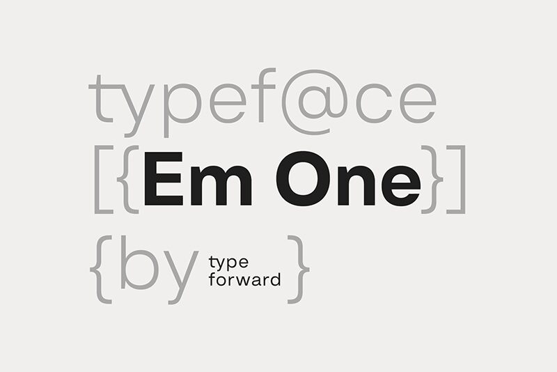
Em One SemiBold Italic font designed by Type Forward Foundry is a clean and minimalistic sans-serif. This modern typeface balances simple aesthetics with a high x-height allowing it to be compact and visually appealing. The font has moderate proportions with minimal contrasts making it both functional and timeless in character. Interested users can have this font for free.
With its versatile style, Em One SemiBold Italic is perfectly handy for websites, apps, magazines, books, journals, brochures, advertisements, environmental graphics, corporate identities, office communications like emails or letters em headings or body text alike.
--
Get the full font:
https://www.typeforward.com/typefaces/em-one
Design Approach:
Em One is the first typeface developed in collaboration with our colleague Luboslav Boyanov, a graduate of the National Academy of Art Sofia. Our aim was to create a functional typeface with a broad range of applications, including web and print, branding, editorial design, and various other contexts. This typeface embodies the distinctive character and aesthetics of classic Swiss design while maintaining a straightforward appearance.
Distinct Features:
Key features of Em One include a tall x-height, minimal contrast between strokes, and moderate proportions that enhance readability. Refined letter spacing contributes to its overall appeal, while unique elements in certain letters add character without introducing excessive visual noise. This makes Em One versatile and well-balanced between functionality and graphic identity.
Font Family Composition:
Em One consists of 9 weights ranging from Thin to Black, each with a corresponding italic version. It is available in refined OTF, TTF, and web font formats. Additionally, a variable font format offers greater flexibility for dynamic design solutions.
Technical Specifications:
Designed for a diverse audience, Em One supports over 220 languages including Extended Latin and Cyrillic characters. It incorporates numerous typographic features such as ligatures, stylistic sets, contextual alternatives, and OpenType functionalities.
Usage:
Em One is multifunctional and adaptable; the various weights can serve as standalone elements or be integrated into cohesive design systems. Thicker and thinner weights are ideal for headlines and display use while middleweights are optimized for text blocks. Specifically optimized for screens, Em One performs well across media formats by balancing glyphs with negative space for effective print use.
Summary:
Em One is a practical sans-serif typeface influenced by popular Swiss designs from the mid-20th century. Built as a multipurpose font, it excels in both display graphics and functional contexts while remaining recognizable and characterful.
Mapa znaków
Proszę korzystać z menu rozwijalnego aby podglądać różne mapy znaków zawierane do tej czcionki.

Podstawowe informacje o czcionce
Rodzina czcionki
Em One SemiBold
Podrodzina czcionki
Italic
Wyjątkowa identyfikacja podrodziny
1.000;SPT;EmOne-SemiBoldItalic
Pełna nazwa czcionki
Em One SemiBold Italic
Nazwij Wersję tabelki
Version 1.000
Postscriptowe imiona czcionki
EmOne-SemiBoldItalic
Producent
Projektant
Opis
Geometric Typeface
Rozszerzone informacje o czcionce
Obsługiwane platformy
PlatformaKodowanie
UnicodeUnikod 2.0 a nasledovná sémantika, tylko BMP unikod
MicrosoftTylko BMP unikod
Szczegóły czcionki
Stworzony2024-08-23
Korekta1
Liczba znaków609
Jednostki po Em1000
Prawa osadzeniaOsadzanie na podgląd i drukowanie dozwolone
Klasa rodzinyBez szeryfów
GrubośćPogrubiona
SzerokośćPodstawowa
Styl MacPodkreślany
KierunekTylko znaki skierowane od lewej do prawej + zawiera neutralie
Natura wzoruKursywa
GęstośćNierówny
Kompletna paczka zawiera 2 grubości które są wymienione poniżej:
EmOne-SemiBoldItalic.ttf
EmOne-SemiBold.ttf
EmOne-SemiBold.ttf
Em One SemiBold
TrueTypeFreeware
