Farisea Dark
TrueTypeDo użytku osobistego
- Euro
Farisea-Dark-demo-ffp.ttf
Tagi
Uwaga autora
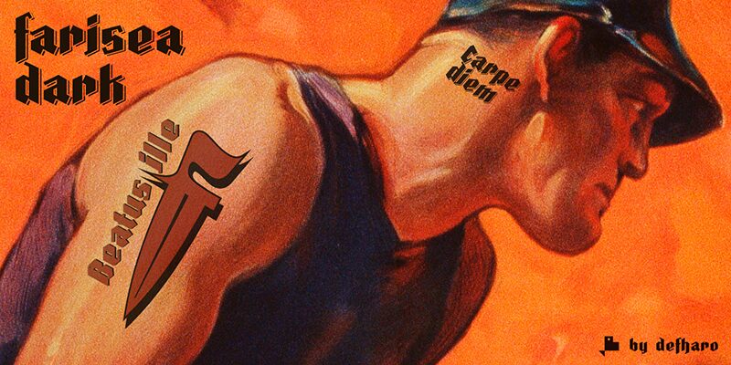
Fraktur is a typographic style of the Latin alphabet derived from the Gothic writing that arose at the beginning of the XVI century and was popularized in Germany, Northern Europe and the Baltic countries. These fonts are distinguished by their thick strokes and the angled profile produced by the pen. Farisea Fraktur is my modern version of this type of Fraktur fonts, without embellishments, the initial inclination is of 64 for the upper and lower ascending finials, it has a great contrast between antlers and a generous height of x, which gives the font in a square proportion.
On this occasion I offer 4 versions of the typography combinable by layers to create multicolored holders purely typographical. Today, this type of fonts continues to be used for the creation of diplomas, etc. also in some German-speaking press media, also having many followers among tattoo enthusiasts.
=============
OTHER STYLES & COMMERCIAL LICENSES: https://defharo.com/fonts/farisea-fraktur/
On this occasion I offer 4 versions of the typography combinable by layers to create multicolored holders purely typographical. Today, this type of fonts continues to be used for the creation of diplomas, etc. also in some German-speaking press media, also having many followers among tattoo enthusiasts.
=============
OTHER STYLES & COMMERCIAL LICENSES: https://defharo.com/fonts/farisea-fraktur/
Mapa znaków
Proszę korzystać z menu rozwijalnego aby podglądać różne mapy znaków zawierane do tej czcionki.

Podstawowe informacje o czcionce
Prawa autorskie
Copyright (c) 2018 by deFharo. All rights reserved.
Rodzina czcionki
Farisea Dark
Podrodzina czcionki
Regular
Wyjątkowa identyfikacja podrodziny
Version 1.186;DFHA;FariseaDark;2018;FLVI-611
Pełna nazwa czcionki
Farisea Dark
Nazwij Wersję tabelki
Version 1.186
Postscriptowe imiona czcionki
FariseaDark
Zawiadomienie o znaku towarowym
Farisea Dark is a trademark of deFharo.
Producent
Projektant
Rozszerzone informacje o czcionce
Obsługiwane platformy
PlatformaKodowanie
UnicodeUnikod 2.0 a nasledovná sémantika, tylko BMP unikod
MacintoshAntykwa (roman)
MicrosoftTylko BMP unikod
Szczegóły czcionki
Stworzony2018-12-15
Korekta1
Liczba znaków180
Jednostki po Em1000
Prawa osadzeniaOsadzania ograniczona (zabroniona!)
Klasa rodzinyNieklasyfikowane
GrubośćGruba
SzerokośćPodstawowa
Styl MacPogrubiony
KierunekTylko znaki skierowane od lewej do prawej + zawiera neutralie
Natura wzoruRegularny
GęstośćNierówny