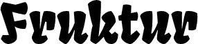
Fruktur by Sorkin Type Co is a free comic display font with chunky, irregular letters and a mischievous cut-paper look. Broad shapes shift between blunt curves and sharp wedges, and the changing widths, tilted details, and pinched joins give the lettering a rowdy, hand-cut rhythm.
A candy or snack brand could use its playful bite for packaging, shop signage, and family event posters. In game graphics and children's merchandise, the crooked silhouettes can become part of a monster, jungle, or storybook emblem, turning the name itself into a piece of the illustration.
Fruktur appears to be a playful and powerful black letter type at Fruktur initially appears to be a playful and powerful black letter type with a warm friendly feeling. However its construction is closer to that of an upright italic. Fruktur offers some of the feeling of a black letter but with higher legibility and greater utility than is typical of black letter type. Fruktur will be most useful from medium to large sizes.
Rozszerzone informacje o czcionce
Obsługiwane platformy
PlatformaKodowanie
UnicodeUnikod 2.0 a nasledovná sémantika, tylko BMP unikod
MacintoshAntykwa (roman)
MicrosoftTylko BMP unikod
Szczegóły czcionki
Utworzono2013-01-10
Wersja1
Liczba glifów437
Jednostki na em2048
Prawa osadzaniaOsadzania dla stałych instalacji
Klasa rodzinyNieklasyfikowane
GrubośćPółgruba
SzerokośćPodstawowa
Styl MacPogrubiony
KierunekTylko znaki skierowane od lewej do prawej + zawiera neutralie