Kaput Black
TrueTypeDo użytku osobistego
- Akcenty (częściowe)
- Euro
Kaput-Black-FFP.ttf
Tagi
Uwaga autora
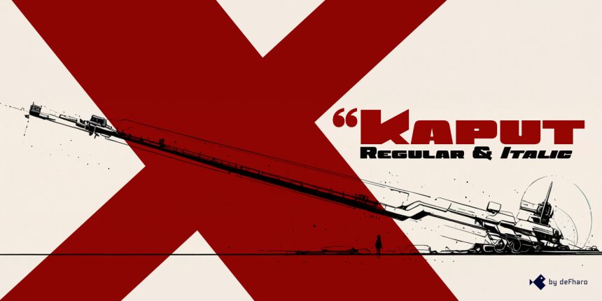
Kaput Black, a unique, heavy uppercase typeface, is here to create great titles and high-impact visual communication.
Kaput Black is designed with a perfect balance between strength and sophistication, it is bold, semi-expanded and spectacularly legible, the thick lines and horns with marked contrasts, which not only catch the eye, but also provide real harmony, thanks to the meticulous work of metrics and kerning.
Available in Regular and Italic versions with a 20-degree tilt that adds dynamism, modernity and technology.
=========================
DOWNLOAD FULL VERSIONS & LICENSES: https://defharo.com/fonts/kaput/
=========================
Mapa znaków
Proszę korzystać z menu rozwijalnego aby podglądać różne mapy znaków zawierane do tej czcionki.

Podstawowe informacje o czcionce
Prawa autorskie
Copyright (c) 2024 by deFharo. All rights reserved.
Rodzina czcionki
Kaput Black Black
Podrodzina czcionki
Regular
Wyjątkowa identyfikacja podrodziny
Version 2.244;DFHA;KaputBlack;2024;FL842
Pełna nazwa czcionki
Kaput Black
Nazwij Wersję tabelki
Version 2.244
Postscriptowe imiona czcionki
KaputBlack
Zawiadomienie o znaku towarowym
Kaput Black is a trademark of deFharo.
Producent
Projektant
Opis
Kaput Black, a heavy and unique uppercase typeface family, is here to revolutionize the way we conceive great titles and high-impact visual communication.
Kaput is designed with a perfect balance between strength and sophistication, it is bold, semi-expanded and spectacularly legible, the thick lines and horns with marked contrasts, not only capture attention, but also provide meticulous harmony, thanks also to a thorough work on metrics and kerning.
Available in Black and Black Italic versions, the 20-degree inclination of the italic version adds a touch of dynamism and modernity.
Rozszerzone informacje o czcionce
Obsługiwane platformy
PlatformaKodowanie
UnicodeUnikod 2.0 a nasledovná sémantika, tylko BMP unikod
MacintoshAntykwa (roman)
MicrosoftTylko BMP unikod
Szczegóły czcionki
Stworzony2024-11-24
Korekta2
Liczba znaków243
Jednostki po Em1000
Prawa osadzeniaOsadzania ograniczona (zabroniona!)
Klasa rodzinyBez szeryfów
GrubośćBardzo gruba
SzerokośćBardzo rozszerzone
Styl MacPogrubiony
KierunekTylko znaki skierowane od lewej do prawej + zawiera neutralie
Natura wzoruRegularny
GęstośćNierówny