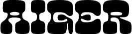
Laurel or Hardy by Norwegian Ink / Design for Dough is a free groovy display font built from rounded geometry and dramatic shifts in stroke width. Slim, open curves alternate with broad blocky forms, and repeated capsule-shaped spaces give the lettering a distinctly 1970s futuristic look.
Packaging is an especially good setting for these smooth, emblem-like letters, particularly on cosmetics, sweets, or playful lifestyle products. Their modular construction also suits music posters, fashion branding, and event graphics, where the type can echo rounded patterns and space-age illustration.
--
The font consists of two variations: lowercase (laurel) and uppercase (hardy).
It was originally designed as a logotype for a design agency in Oslo, Norway. It is based on a strict pattern of vertical thick and thin lines achieved by switching between uppercase and lowercase glyphs, for example, “desiGN.”
Punctuation and numerals can be added upon request. At present, this is a display font.
This is shareware. If you use this font, please share a screenshot of the publication.
font@norwegianink.com