Novecento slab condensed Normal
OpenTypeFreeware
- Akcenty (częściowe)
- Akcenty (pełne)
- Euro
Novecentoslabcondensed-Normal.otf
Tagi
Uwaga autora
Novecento Slab Condensed Normal font by synthview is a condensed and modern free serif font. Structured, geometric, with clean lines and a classic serif influence, the font is perfect for users searching for aestheticism and beauty.
Use it to create elegant logos, shop signs, merchandise design such as badges and labels. It will fit nicely also in short paragraphs not limited to magazine articles, poster designs with old vintage touches.
--
Two of the 32 styles from the Novecento Slab font family are available for free for both commercial and non-commercial use, limited to desktop installation only (no webfonts).
By downloading these files, you agree to the End-User License Agreement (EULA) included in the Zip file.
For webfont, ebook, software embedding, or OEM licenses, please visit myFonts or Fontspring.
The complete Novecento Slab family is also accessible through Adobe Fonts and Monotype Fonts.
For a full set and detailed description of font features, please visit https://typography.synthview.com/novecento-slab-font-family.php
Mapa znaków
Proszę korzystać z menu rozwijalnego aby podglądać różne mapy znaków zawierane do tej czcionki.

Podstawowe informacje o czcionce
Rodzina czcionki
Novecento slab condensed Normal
Podrodzina czcionki
Regular
Wyjątkowa identyfikacja podrodziny
1.001;SVTD;Novecentoslabcondensed-Normal
Pełna nazwa czcionki
Novecento slab condensed Normal
Nazwij Wersję tabelki
Version 1.001;PS 001.001;hotconv 1.0.70;makeotf.lib2.5.58329
Postscriptowe imiona czcionki
Novecentoslabcondensed-Normal
Producent
Projektant
Opis
OVERVIEW:
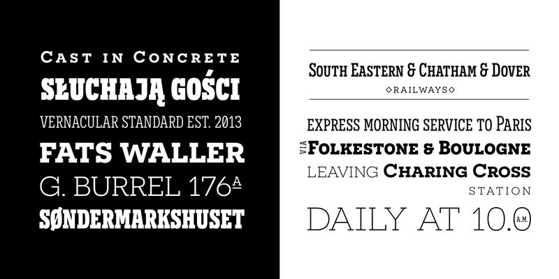
Novecento Slab is the “slab serif” companion of Novecento Sans, an uppercase + smallcaps font family inspired on european typographic tendencies between the second half of 19th century and first half of the 20th.
As the excellent French typographer Xavier Dupré said “it seems to have been cast in concrete”. Despite its blocky look, Novecento Slab’s lettershapes are optically corrected and balanced.
This font face is designed to be used mostly for headlines, visual identities or short sentences, both in big and small sizes.
Novecento Slab family was spaced and kerned with love and patience; each font has between 750 and 950 group kerning pairs.
This font is available for licensing in opentype and webfont format, as well as for mobile apps, ebooks and for software embedding.
OPENTYPE FEATURES:
AALT
Accesses All Alternate glyphs from the Glyphs panels in Adobe Illustrator or Indesign.
CASE
Sets All-Caps to activate case sensitive forms: transform lowercase letters, figures and some extra signs to Uppercase; vertically aligns math symbols and punctuation.
DNOM & NUMR
Transforms 0 to 9 figures into numerators (aligned to cap height) and denominators (aligned to baseline).
FRAC
Custom fractions generation feature.
SUPS
Transforms 0 to 9 figures into superiors.
LOCL
Romanian, Moldavian and Polish advanced diacritics support; automatic Catalan punt volant; Dutch localization for accented ij; localization for Turkish i (works also for Kazakh, Tatar, Crimean Tatar, Azeri. Just select your text language to activate the localized accents)
CALT
detects German ß in an uppercase string and substitute it with its uppercase version/
SS01 / SALT
Alternate Q letter shape for ultra narrow line heights.
Implemented both as Stylistic Set n°1 (ss01) and Stylistic Alternate (salt) to maximize compatibility between applications.
SS02 / SALT
Alternate N letter shape. Implemented both as Stylistic Set n°2 (ss02) and Stylistic Alternate (salt) to maximize compatibility between applications.
SS03 / SALT
Alternate I letter shape. Implemented both as Stylistic Set n°3 (ss03) and Stylistic Alternate (salt) to maximize compatibility between applications.
SS04 / SALT
Alternate J letter shape. Implemented both as Stylistic Set n°4 (ss04) and Stylistic Alternate (salt) to maximize compatibility between applications.
SS05 / SALT
Alternate Y letter shape. Implemented both as Stylistic Set n°5 (ss05) and Stylistic Alternate (salt) to maximize compatibility between applications.
LNUM/ONUM
Lining / oldstyle figures; LNUM transforms numbers and monetary symbols in Uppercase; ONUM do the opposite (default figures are ONUM).
TNUM / PNUM
Tabular/ proportional figures. Figures (numbers, monetary and math symbols) of same width always align, in spite of their weight.
ZERO / SALT
Slashed zero alternate glyph. Works with tabular and proportional figures, numerators, denominators and superiors. Implemented both as Zero as Salt to maximize compatibility between applications.
Rozszerzone informacje o czcionce
Obsługiwane platformy
PlatformaKodowanie
UnicodeUnikod 2.0 a nasledovná sémantika, tylko BMP unikod
MacintoshAntykwa (roman)
MicrosoftTylko BMP unikod
Szczegóły czcionki
Stworzony2013-10-07
Korekta1
Liczba znaków371
Jednostki po Em1000
Prawa osadzeniaOsadzania dla redagowania dozwolone
Klasa rodzinySlab szeryfy
GrubośćŚrednio lekka
SzerokośćŚciśnięta
Styl MacPogrubiony
KierunekTylko znaki skierowane od lewej do prawej + zawiera neutralie
Natura wzoruRegularny
Kompletna paczka zawiera 2 grubości które są wymienione poniżej:
Novecentoslabcondensed-Normal.otf
Novecentoslabwide-Normal.otf
Novecentoslabwide-Normal.otf
Novecento slab wide Normal
OpenTypeFreeware