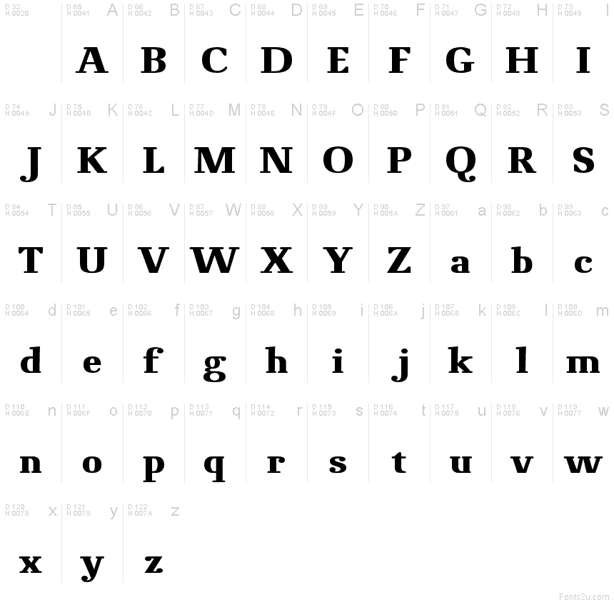
NovelloPro-Bold
OpenTypeDemoAktualizowane
- Akcenty (częściowe)
- Akcenty (pełne)
Novello_Pro_Bold.otf
Tagi
Uwaga autora
A moderate Roman typeface with round serifs and modern details.
The goal in designing Novello Pro was to create a robust, usable Antiqua which would also print well on low-quality paper and would remain clearly legible even under adverse circumstances. In order to attain this goal, all the traditional unnecessary weight which justifiably could be disposed of was.
A bit of tradition remains in Novello Pro thanks to alternating thick and thin strokes. Basic character forms comply with what is generally considered the traditionally correct shape. The short round serifs are attached to the bodies of the letters at a right angle while the alternation of strokes follows a legitimate construction. The most striking characteristic of Novello Pro is the horizontal thin stroke as well as the joining in the stem on a, b, d, h n, m, p, q, r, and u. The typical gentle movement of the "upstroke" from the stem vanishes completely and is broken off so that a horizontal movement with emphasis on the right angle results on all of the aforementioned letters. In this way, unnecessary rounding off is avoided and the font leaves the impression of an almost modern sans serif type.
At ingoFonts all fonts can be downloaded. Gratis. Free.
Here's the catch: The files offered here to download contain only a reduced font. That means, the font only consists of uppercase and lowercase from A to Z or rather, a to z.
The complete font including numerals, umlauts, punctuation and especially ligatures is only available with your order and your cash.
Mapa znaków
Proszę korzystać z menu rozwijalnego aby podglądać różne mapy znaków zawierane do tej czcionki.

Podstawowe informacje o czcionce
Prawa autorskie
Copyright (c) 2006 by ingoFonts Ingo Zimmermann. All rights reserved.
Rodzina czcionki
Novello Pro
Podrodzina czcionki
Bold
Wyjątkowa identyfikacja podrodziny
ingoFontsIngoZimmermann: Novello Pro Bold: 2006
Pełna nazwa czcionki
NovelloPro-Bold
Nazwij Wersję tabelki
Version 1.002 2006
Postscriptowe imiona czcionki
NovelloPro-Boldreduced
Zawiadomienie o znaku towarowym
Novello Pro is a trademark of ingoFonts Ingo Zimmermann.
Producent
Projektant
Opis
Copyright (c) 2006 by ingoFonts Ingo Zimmermann. All rights reserved.
Rozszerzone informacje o czcionce
Obsługiwane platformy
PlatformaKodowanie
MicrosoftUnikod - pełny repertuar
Tylko BMP unikod
MacintoshAntykwa (roman)
UnicodeUnikod 2.0 a nasledovná sémantika, tylko BMP unikod
Szczegóły czcionki
Stworzony2009-03-15
Korekta1
Liczba znaków248
Jednostki po Em1000
Prawa osadzeniaOsadzania dla stałych instalacji
Klasa rodzinyNowoczesne szeryfy
GrubośćPółgruba
SzerokośćPodstawowa
Styl MacKursywa
KierunekTylko znaki skierowane od lewej do prawej + zawiera neutralie
Natura wzoruWyrazisty
Kompletna paczka zawiera 3 grubości które są wymienione poniżej:
Novello_Pro_Bold.otf
Novello_Pro_Normal.otf
Novello_Pro_Italic.otf
Novello_Pro_Normal.otf
Novello_Pro_Italic.otf
NovelloPro
OpenTypeDemoAktualizowane
NovelloPro-Italic
OpenTypeDo użytku osobistego