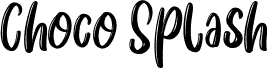
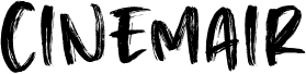
Same Same But Different by David Kerkhoff is a free script with tall, loosely drawn letters and forceful changes in stroke width. The forms lean and lurch rather than settling into a regular line. Long sweeps, blunt joins, and ink-like roughness give the lettering the immediacy of a painted sign.
It is strongest on music posters, where its restless silhouette can match loud photography and improvised graphics. It also suits streetwear branding and festival merchandise. The extended strokes can cross into collage, paint marks, or hand-drawn illustration, making the words part of the artwork rather than a caption.