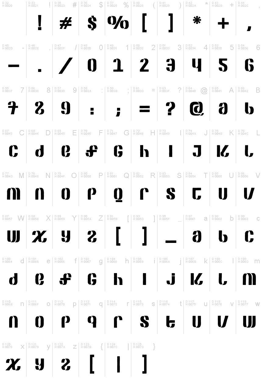
SEPAGAN Regular
OpenTypeFreeware
- Akcenty (częściowe)
- Euro
SEPAGAN-Regular.otf
Tagi
Uwaga autora
SEPAGAN is a unique display typeface designed by Raul Plancarte of Todayslogo.
SEPAGAN (as in SEP and [the illustrations] are paid for) is a typeface designed from the need to create awareness in the Mexican creative industry, regarding an open call released by the Public Education Secretariat, which invites the professionals to create illustrations to be published in the forthcoming 2021-2022 basic education textbooks, which are distributed free of charge and used in both public and private schools. In exchange of their graphic works, the Secretariat proposes to pay them only with a certificate, one printed exemplar and the authors credits. This invitation clearly shows the constant precarious work conditions and the low social value the institutions assign to the illustrators guild, and also to other visual artists.
This free font is inspired in the legendary former logo of the SEP, developed in 1977 by the designers Luis Almeida, JGP Y SV, at the DP SA studio. The rough edges (unfinished, unprofessional) of the characters constitute a visual analogy (or representation) of the strong disgust that the open call for illustrations caused. Also this visual treatment keeps distance with the original logo and emphasizes the ironic tone of this proposal. charge of the National Institute of Copyright should be one of the main champions in favor of the proper payment and recognition of the illustrators hard labor.
Traced by the Mexican typographer RP, the SEPAGAN digital typeface is born as a protest medium supporting this cause.
Merida, Yucatan, Mexico. April 2021.
Mapa znaków
Proszę korzystać z menu rozwijalnego aby podglądać różne mapy znaków zawierane do tej czcionki.

Podstawowe informacje o czcionce
Rodzina czcionki
SEPAGAN
Podrodzina czcionki
Regular
Wyjątkowa identyfikacja podrodziny
1.000;UKWN;SEPAGAN Regular
Pełna nazwa czcionki
SEPAGAN Regular
Nazwij Wersję tabelki
Version 1.000;FEAKit 1.0
Postscriptowe imiona czcionki
SEPAGAN-Regular
Producent
Projektant
Rozszerzone informacje o czcionce
Obsługiwane platformy
PlatformaKodowanie
UnicodeUnikod 2.0 a nasledovná sémantika, tylko BMP unikod
MicrosoftTylko BMP unikod
Szczegóły czcionki
Stworzony2021-04-03
Korekta1
Liczba znaków147
Jednostki po Em1000
Prawa osadzeniaOsadzania dla redagowania dozwolone
Klasa rodzinyNieklasyfikowane
GrubośćPółgruba
SzerokośćPodstawowa
Styl MacPogrubiony
KierunekTylko znaki skierowane od lewej do prawej + zawiera neutralie
Natura wzoruRegularny
