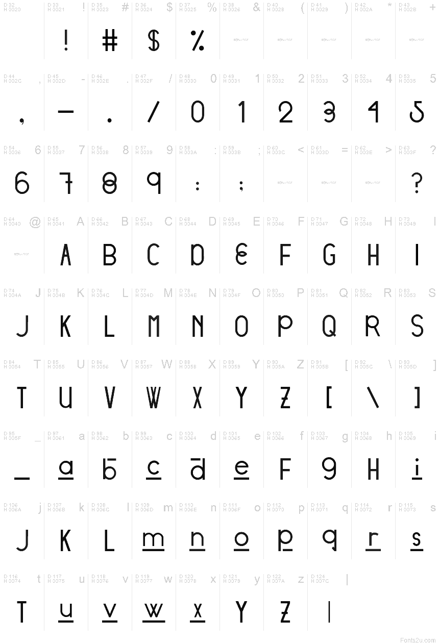
Stratford Sans
TrueTypeDemo
- Euro
Stratford Sans - DEMO.ttf
Tagi
Uwaga autora
DESIGNED BY: Victoria Vandenberg from @BonaFideCraft
The objective of Stratford Sans was to pull from both ends of the spectrum through combining vintage + modern typographic elements to create a font that would seamlessly amalgamate itself into the story of your designs.
Design Process
The initial design process pulled from finding a voice for the city of Stratford, Ontario. The city has a strong scene of traditional arts + culture and is focused on adding digital culture + flair to the mix. The city is expressive, traditional, and unexpected. Therefore, elements tipping a hat to traditional British letterforms and the fluid combination of grotesque era ovals and unforeseen hints of geometric characters are what truly send Stratford Sans into a realm of its own.
The initial design decision was that Stratford Sans would, in fact, be a sans serif font. This is to pull away from its branding of traditional arts and giving it the opportunity to newly define itself, whilst still allowing the magic that is its history, to seep through its characters. Interlacing two conflicting themes gives you the ability to craft a harmony between the two: to pull the exciting and non-negotiable defining elements of each - and defining a new sensation.
Mapa znaków
Proszę korzystać z menu rozwijalnego aby podglądać różne mapy znaków zawierane do tej czcionki.

Podstawowe informacje o czcionce
Prawa autorskie
Copyright (c) 2018 by Victoria Vandenberg - Bona Fide Craft. All rights reserved.
Rodzina czcionki
Stratford
Podrodzina czcionki
Regular
Wyjątkowa identyfikacja podrodziny
VictoriaVandenberg-BonaFideCraft: Stratford Sans: 2018
Pełna nazwa czcionki
Stratford Sans
Postscriptowe imiona czcionki
Stratford Sans
Zawiadomienie o znaku towarowym
Stratford Sans is a trademark of Victoria Vandenberg - Bona Fide Craft.
Producent
Victoria Vandenberg - Bona Fide Craft
Projektant
Opis
Copyright (c) 2018 by Victoria Vandenberg - Bona Fide Craft. All rights reserved.
Rozszerzone informacje o czcionce
Obsługiwane platformy
PlatformaKodowanie
UnicodeUnikod 2.0 a nasledovná sémantika, tylko BMP unikod
MacintoshAntykwa (roman)
MicrosoftTylko BMP unikod
Szczegóły czcionki
Stworzony1969-12-31
Korekta1
Liczba znaków95
Jednostki po Em1000
Prawa osadzeniaOsadzanie na podgląd i drukowanie dozwolone
Klasa rodzinyNieklasyfikowane
GrubośćŚrednio lekka
SzerokośćPodstawowa
Styl MacPogrubiony
KierunekTylko znaki skierowane od lewej do prawej + zawiera neutralie
Natura wzoruRegularny
GęstośćNierówny