Wanders
OpenTypeGNU/GPL
- Akcenty (częściowe)
- Akcenty (pełne)
- Euro
Wanders.otf
Tagi
Uwaga autora
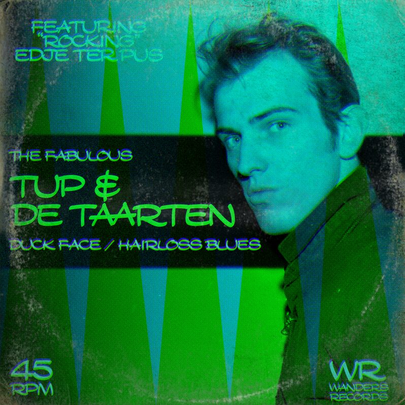
The Wanderers font will bring a fresh and exciting look to all of your projects. With its thick and sharp lines combined with the exaggerated curves and shapes, the Wanderers font is very similar to Walt Disney’s characters font and the styles used on cartoons from back in the day.
The striking features of the characters combined with the black color make this font visually effective to deliver a bold and strong message at a glance. This stylish handwritten font is available in OTF format.
You can add it to your poster, headline, or even print your company name on a cap! Make sure to follow Tup Wanders for more interesting free fonts.
--
Here's hoping that people will choose to use this font instead of my earlier font, Snickles, which I have come to dislike. :)
Mapa znaków
Proszę korzystać z menu rozwijalnego aby podglądać różne mapy znaków zawierane do tej czcionki.

Podstawowe informacje o czcionce
Prawa autorskie
Copyright Tup Wanders. All Rights Reserved.
Rodzina czcionki
Wanders
Podrodzina czcionki
Regular
Wyjątkowa identyfikacja podrodziny
Wanders:Version 1.00
Pełna nazwa czcionki
Wanders
Nazwij Wersję tabelki
Version 1.00;November 25, 2024;FontCreator 11.5.0.2430 64-bit
Postscriptowe imiona czcionki
Wanders
Zawiadomienie o znaku towarowym
nah
Producent
Projektant
Opis
Made by Tup Wanders using FontCreator 11.5 from High-Logic.com
Nou lief dagboek, dit is geloof ik al het vierde font dat ik in nde afgelopen weken maakte. Het hondje is inmiddels terug naar m'n moeder, ik kan weer lekker uitslapen.
Deze letter komt van mijn vader, ik heb hem als puber van hem gekopieerd. Maar zijn versie was wel veel krulleriger, een beetje zoals Walt Disney. Als je D-A-N typt krijg je zijn krullerige D als ligatuur. Gewoon een doorsnee stripletter. Niks bijzonders verder.
Nou dag hoor, tot de volgende letter
Tuppus
Rozszerzone informacje o czcionce
Obsługiwane platformy
PlatformaKodowanie
UnicodeUnikod 2.0 a nasledovná sémantika, tylko BMP unikod
MacintoshAntykwa (roman)
MicrosoftTylko BMP unikod
Szczegóły czcionki
Stworzony2023-08-14
Korekta1
Liczba znaków398
Jednostki po Em2048
Prawa osadzeniaOsadzania dla stałych instalacji
Klasa rodzinySkrypty
GrubośćŚrednia
SzerokośćRozszerzone
Styl MacPogrubiony
KierunekTylko znaki skierowane od lewej do prawej
Natura wzoruRegularny
GęstośćNierówny