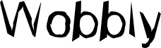
Wobbly to darmowy, zniekształcony krój display o nerwowym, ręcznie wycinanym charakterze. Litery przechylają się i zwężają w nieregularny sposób, łącząc surowe, zaokrąglone kształty z ostrymi jak brzytwa kreskami, co sprawia, że cały font jest celowo nierówny i pełen zabawy.
Dzięki temu świetnie sprawdzi się na nagłówkach plakatów, okładkach zinów, grafikach indie, ulotkach na Halloween czy w tytułach, gdzie darmowy font może wnieść nieco niepokojący, ręczny akcent. Najlepiej wypada w krótkich frazach, logotypach i dużych cytatach, ponieważ chwiejność każdej litery staje się przekazem w równym stopniu, co same słowa.
Monotype Type Drawing Office - Robin Nicholas, Patricia Saunders 1982
Opis
Contemporary sans serif design, Arial contains more humanist characteristics than many of its predecessors and as such is more in tune with the mood of the last decades of the twentieth century. The overall treatment of curves is softer and fuller than in most industrial style sans serif faces. Terminal strokes are cut on the diagonal which helps to give the face a less mechanical appearance. Arial is an extremely versatile family of typefaces which can be used with equal success for text setting in reports, presentations, magazines etc, and for display use in newspapers, advertising and promotions.