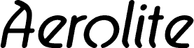
Aerolite Italic by Jan Paul is a free retro display font with long, rounded strokes and an unmistakable 1970s flavor. The letters shift between narrow uprights and broad curves, producing an irregular silhouette that feels custom drawn. Soft joins and occasional sharp turns keep the design lively across a line.
Independent record labels, vintage clothing shops, and relaxed music events could use it for branding with a handmade period reference. Its strongest role is in logos, album artwork, and poster titles aimed at audiences drawn to offbeat 1970s graphics rather than strict geometric nostalgia.
--
Aerolite © 2010 is a font family designed by Jan Paul and digitized by Brian Kent in New York. It was developed for a Midnight Oil album known as “The Blue Meanie” and has since been associated with surfing.
The family includes six OpenType fonts and six TrueType fonts with extensive kerning.
Aerolite is free for personal use. For light commercial use, please make a donation in the provided box. For major commercial work, contact Jan Paul at:
graphique@gmail.com
The basic character map contains 196 glyphs, including accented characters for common foreign languages. An extended set supporting 65 languages is available at:
https://www.cheapprofonts.com/Aerolite_Pro_Regular.php