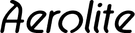
Aerolite, designed by Jan Paul, is a free retro display font with tall, narrow letters and a distinctly space-age silhouette. Rounded monoline strokes meet sharp diagonal cuts, and several forms bend into unexpected loops or open shapes that recall 1970s record sleeves and futuristic signage.
A synth label, nightclub, or fashion brand could use its eccentric geometry across packaging, posters, and merchandise, especially when the brief leans toward vintage futurism. In editorial design, it is well suited to magazine covers and feature openers about electronic music, experimental culture, or period design, where the lettering can establish the era before the photography does.
--
Aerolite © 2010 is a font family designed by Jan Paul and digitized by Brian Kent in New York.
Aerolite was developed for a Midnight Oil album known as “The Blue Meanie.”
The family includes six OpenType fonts and six TrueType fonts, with extensive kerning.
Aerolite is free for personal use. For light commercial use, please make a donation in the provided box. For major commercial work, contact Jan Paul at
graphique@gmail.com
A basic character map of 196 glyphs provides accented characters for common foreign languages. An extended character set for 65 languages is available at
https://www.cheapprofonts.com/Aerolite_Pro_Regular.php